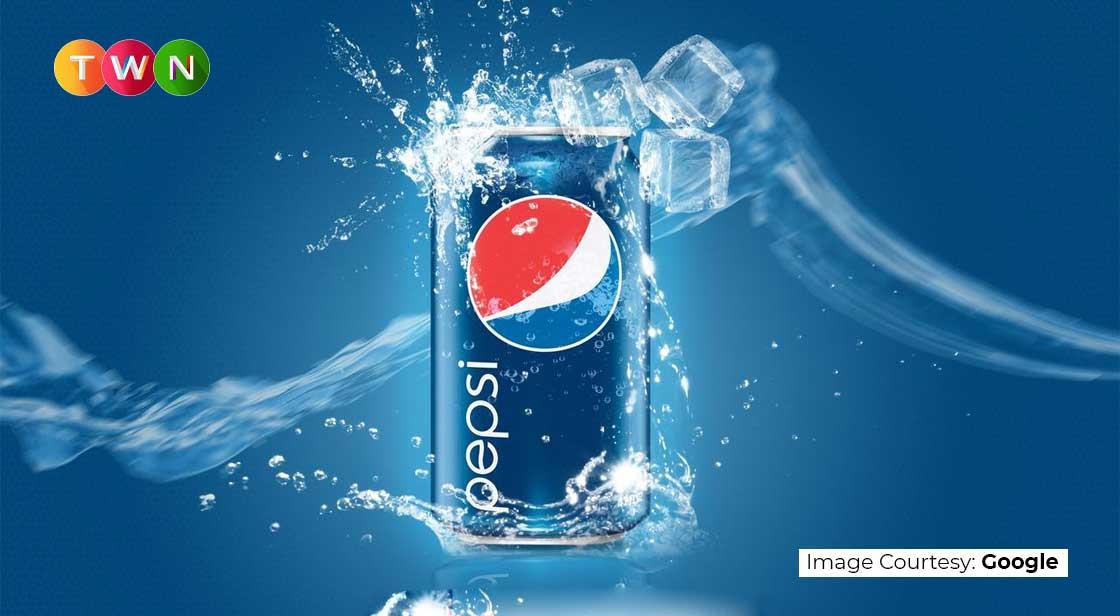
Many classic brands are classic because they use well-known and trusted logos. Pepsi is a great example. Throughout its history, the Pepsi logo has been redesigned numerous times. In its 122-year history, the logo has been redesigned 12 times. Not to mention the minor variations for flavors like Diet Pepsi and Pepsi Max.
Regardless of how many times its logo changes, Pepsi continues to deliver the flavors and brand experience that people expect.
The Pepsi Logo's History
What is the Pepsi logo's history? And how does it manage to retain its recognizability despite each radical redesign? Let's wait and see what happens!
1893: Brad’s Drink
Before Pepsi became Pepsi, it was known as Brad's Drink, which was invented in 1893 in New Bern, North Carolina by pharmacist Caleb Brad ham. Many of the sodas we know and love today were invented by pharmacists around the same time. Coca-Cola was created in 1886 to aid its inventor in his recovery from morphine addiction. Later that decade, pharmacist Charles Alperton developed Dr. Pepper as a digestive aid and a lemon, nutmeg, and caramel-flavored alternative to popular soda flavors at the time.
Brad's Drink's logo is a blue word mark on a white background. The font was large and ornate, which the Pepsi logo would keep for a while after changing colors and becoming known as Pepsi-Cola.
Red and Swirly, 1898-1940
In 1898, Brad's Drink was renamed Pepsi-Cola, a name derived from the word "dyspepsia," which is another word for indigestion. (Recall how soft drinks were once thought to be medicinal.)
From there, the Pepsi-Cola Company grew rapidly. Brad ham registered the name as a trademark in 1903, and within a year, he'd sold 20,000 gallons of Pepsi-Cola syrup. By 1910, there were 240 Pepsi-Cola bottling franchises in 24 states. The company's logo changed three times as it grew and established itself.
Pepsi's thin, red, and spiky logo was the first
The main color of the logo was changed to an eye-catching red when Brad's Drink was renamed Pepsi-Cola. The serifs and mid-height letter spikes of the original font were lengthened, with fang-like spikes protruding from the tops and bottoms of the letters, and the final "A" stretched out and coiled upward like a tail. One constant has been Pepsi-branding Cola as a health drink. At the time, Pepsi's tagline for Cola was "Exhilarating, Invigorating, Aids Digestion."In 1905, the logo became a little softer. The spikes retracted, and the letters widened slightly. The overall shape of the logo remained wavy and swoopy, and the final "A" retained its tail curl. In this version of the logo, a long banner extends from the top of the "C" in Cola, making it feel more symmetrical than the first.
A year later, the logo was changed once more. It was still red and wavy, and it looked suspiciously like the logo of another cola company (more on that in a minute). The 1906 Pepsi-Cola logo thickened and condensed the letters once more, making the letters "P" and "C" slightly taller than the rest of the letters.
Pepsi Company made a few significant changes as well:
· The spiky serifs returned.
· The word "Pepsi" was shifted to an incline, which added energy to the logo.
· The word "drink" was added to the top banner of the C, making the logo a call-to-action.
Tags:
pepsi company, pepsi logo history, pepsi products drinks
Read This Full ARTICLE, Click Here


Comments
Post a Comment