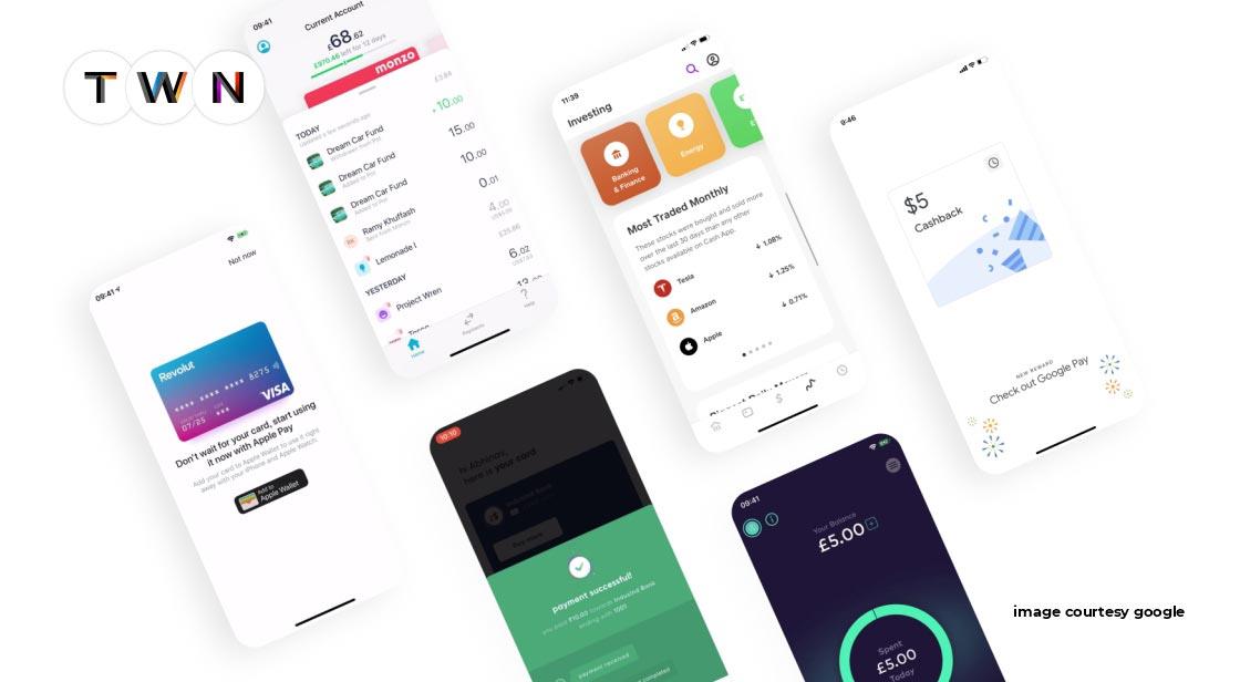
Since the day I saw Apple's Design of a Webpage, I've been a fan of the Modern Minimal. The website of Spline, a 3D modelling programme, piqued my interest even more. These minimalist UI Designs are setting trends, and if you're a UX designer in 2022, you'll need to keep an eye on these developments and incorporate them into your projects.
They're incredible, I tell you!
Minimalism means removing unnecessary items and tastefully organising those that remain. It focuses on the utilisation of space in which colours are usually balanced and little components fill huge spaces. As a result, you can wind up with a basic but effective design that simplifies your message delivery. Minimalism may be found in a variety of creative forms, from architecture to graphic design to fashion, and it has recently proven to be quite beneficial in interface design.
Although minimalist UI design strives for simplicity and reduction in order to eliminate all symbolic allusions and focus the gaze on more important matters such as colour, scale, volume, or the surrounding area, choosing what we choose at work is not as simple as we would like, especially when considering the functionalism aspect.
There was nothing like it before, and I've been waiting a long time for a new, functional, and visually arresting design style to emerge. And it completely captivated me.
In a number of interfaces, I've found comparable layout design structures. These interfaces looked amazing; they were attractive and easy to understand while remaining pleasant and unobtrusive. They seemed to me to be the perfect balance of aesthetics and functionality.
Characteristics of Minimalist User Interface Design
Some of the primary qualities of minimalism that designers usually emphasise are as follows:
• Clarity and simplicity
• A visual hierarchy that reflects
• Proportions and composition are taken into account.
• A vast amount of open space
• Every element's functioning A high ratio of attention to detail
• Getting rid of non-functional ornamental components is a major design element
Let's take a look at some of the newest 2022 simple UI design ideas.
Latest Minimalist UI Design Trends
Whitespace and bright backgrounds
Whitespace and bright backgrounds are the latest minimalist UI design trends.
In modern minimalism, whitespace reigns supreme. The content of the interface is usually shown on a white or extremely bright background. The strategic use of whitespace contributes to the overall appearance of the interface being clean, fresh, and aesthetically pleasing. Minimal UI designs with lots of whitespace appear to be from the future.
Roundness around user interface elements
The UI components in the Modern Minimal style are softly contoured. It makes the UI look more natural and pleasant. If you've seen the latest trend known as Clubhouse, you've probably seen their rounded animated creatures. They give the goods a more distinct and original look!
Who doesn't appreciate the rounded corners?
I prefer rounder edges myself (they are more pleasurable contrary to the sharp ones). The key is to employ roundness only on particular objects like buttons and containers. The radius of the corners must not exceed specific limits (slightly rounded buttons are preferred over fully rounded buttons, however this rule does not apply to entirely rounded buttons).
Use large, readable headings.
Those big, bold headlines are fantastic! They're also upgrading the look of the UI. You can choose serif or sans-serif fonts, but geometric sans-serifs like Gilroy, Sofia Pro, Lufga, or Circular are my favourites. Other alternatives include Konnect, Geliat, Galano, Pulp, Gordita, Visby, and +Jakarta Sans.
The latest UI design trends include minimalist UI design with a large, bold heading, which is here to remain for a long time.
Documentary Photography
Yes! Modern Minimal embraces real-life photography.
I predicted the comeback of real-life photographs earlier. Everyone is weary of the infantile 3D renders, flat people, and hand-drawn scribbles, therefore it was bound to happen. Real-life images offer one big advantage: they appear "real," giving digital goods a sense of realism. Users prefer images to graphics, according to my research, since photos appear more serious and emotionally tied to real-life occurrences.
Carefully chosen colours
Colors are typically kept to a minimum in current minimalist style. They're usually utilised to draw attention to the most important acts and/or elements.
As a result, the interface is attractive to the eye, as no huge splashes of colour are constantly screaming for the user's attention.
Tags:
minimalist ui, minimal ui design, latest ui design trends 2022
Read This Full ARTICLE, Click Here


Comments
Post a Comment